

OVERVIEW
Bitchin' is a Ukrainian brand of unisex accessories, including cotton caps and shoppers with bold phrases. The brand celebrates its uniqueness and challenges stereotypes and prejudices imposed by society, reminding us that being bitchin' means being oneself above all else.
In this case study, I'll outline my design process while working on the Bitchin' website
DESIGN GOALS
Since this brand is rapidly evolving, our client has a need to redirect order traffic from their Instagram page to the future website, thereby increasing the speed of order processing.
The implementation of this plan is intended to be carried out on a website builder platform (such as Wix, Webflow, etc.).
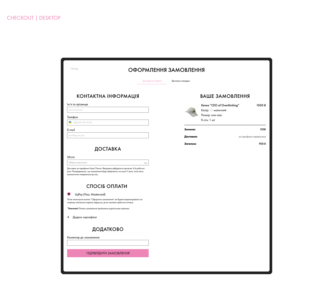
During the determination of the main design goals, we relied on several key challenges that served as primary criteria of our design: a minimalistic yet bold website, straightforward user flow, and comfortable mobile version.


RESEARCH AND INSPIRATION
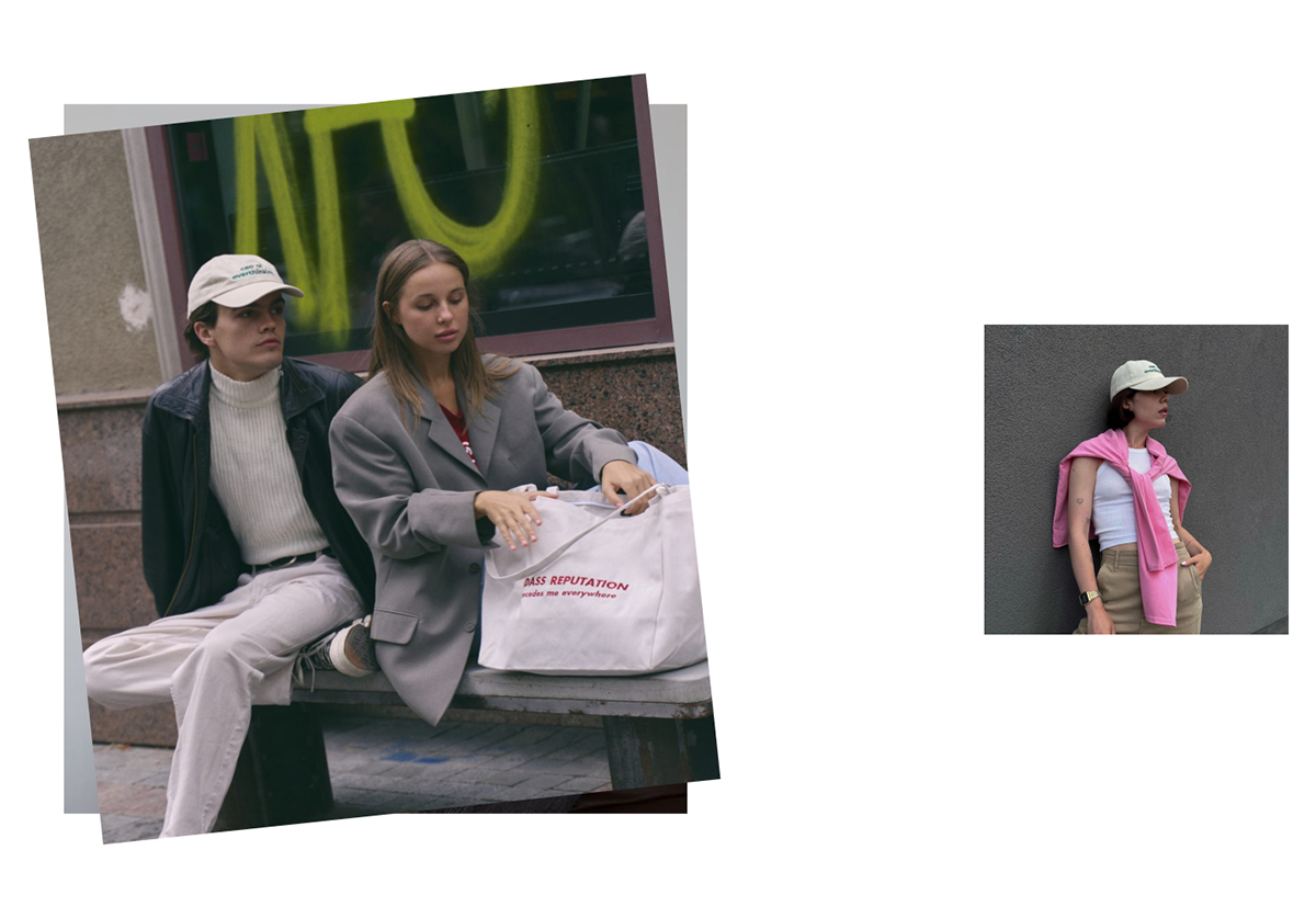
The target audience of the brand consists of young people, predominantly working in digital-related fields. They typically speak English, are interested in fashion and style, and place importance on their appearance and the message conveyed by their current image.
"Bitchin'" means "incredible," and the brand's philosophy revolves around celebrating its uniqueness. The brand's aesthetic is somewhat bold, bright, and youthful, with an urban edge. It aims to evoke a certain emotion, spark discussion, and dialogue.
The inspiration for visual came from large images, bold statements, asymmetry, and chaotic collage-like layouts. I had an idea to create a website that felt like a collage cutout from magazines and Instagram posts.

DESIGN PROCESS
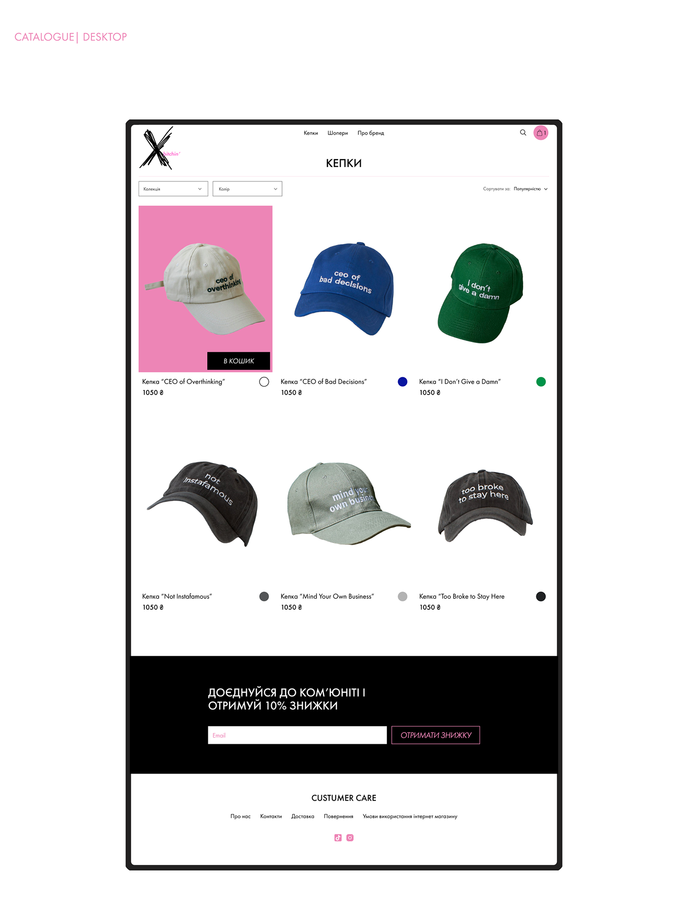
In designing the website structure, I simplified navigation due to the limited number of products and categories. With just two main categories and thematic drops of accessories, each with 1-2 caps, I ensured quick access to categories from the homepage and header menu, without additional subcategories. This guided the wireframe construction.

VISUAL DESIGN
I worked with the approved brand color palette and fonts. It was important for us to use familiar imagery for better brand recognition and consistency. We will continue to use the shade of pink #ED85B6 to highlight details and give them prominence.
Font Futura has clean, modern appearance, geometric shapes which contribute to its legibility, versatility, and timeless aesthetic. This font conveys a sense of modernity, sophistication, and simplicity.


BASKET | DESKTOP


TAKAWAYS
In conclusion, my experience with this ecommerce platform has highlighted several key takeaways. Firstly, a comprehensive analysis of the brand's requirements and target audience is crucial for devising effective visual solutions.
Secondly, even when dealing with a limited number of categories, the importance of efficient sorting and website structure cannot be overstated.
Lastly, by incorporating bold details and microinteractions, it's possible to maintain a minimalist aesthetic while infusing the website with the desired sense of audacity.
These insights will undoubtedly inform and enhance future design endeavors.


